Data Visualization
Organizing dense account, performance, and trading data into clearer, more usable dashboard experiences.

2 Months
Product Designer
I stepped in as interim product design support during a gap in product design coverage, helping improve key areas of the app while a dedicated team was being built. One of the largest pieces of that work was rebuilding a dashboard experience that needed stronger structure, hierarchy, and usability.
Before this work, traders had limited visibility into their trading statistics inside the app. Important account, performance, and trading data existed, but it was not organized into a clear, easy-to-reference experience. I recreated the existing product experience, worked through the available data, and translated it into dashboard modules, charts, gauges, and visual hierarchy that made the information easier to scan and understand.
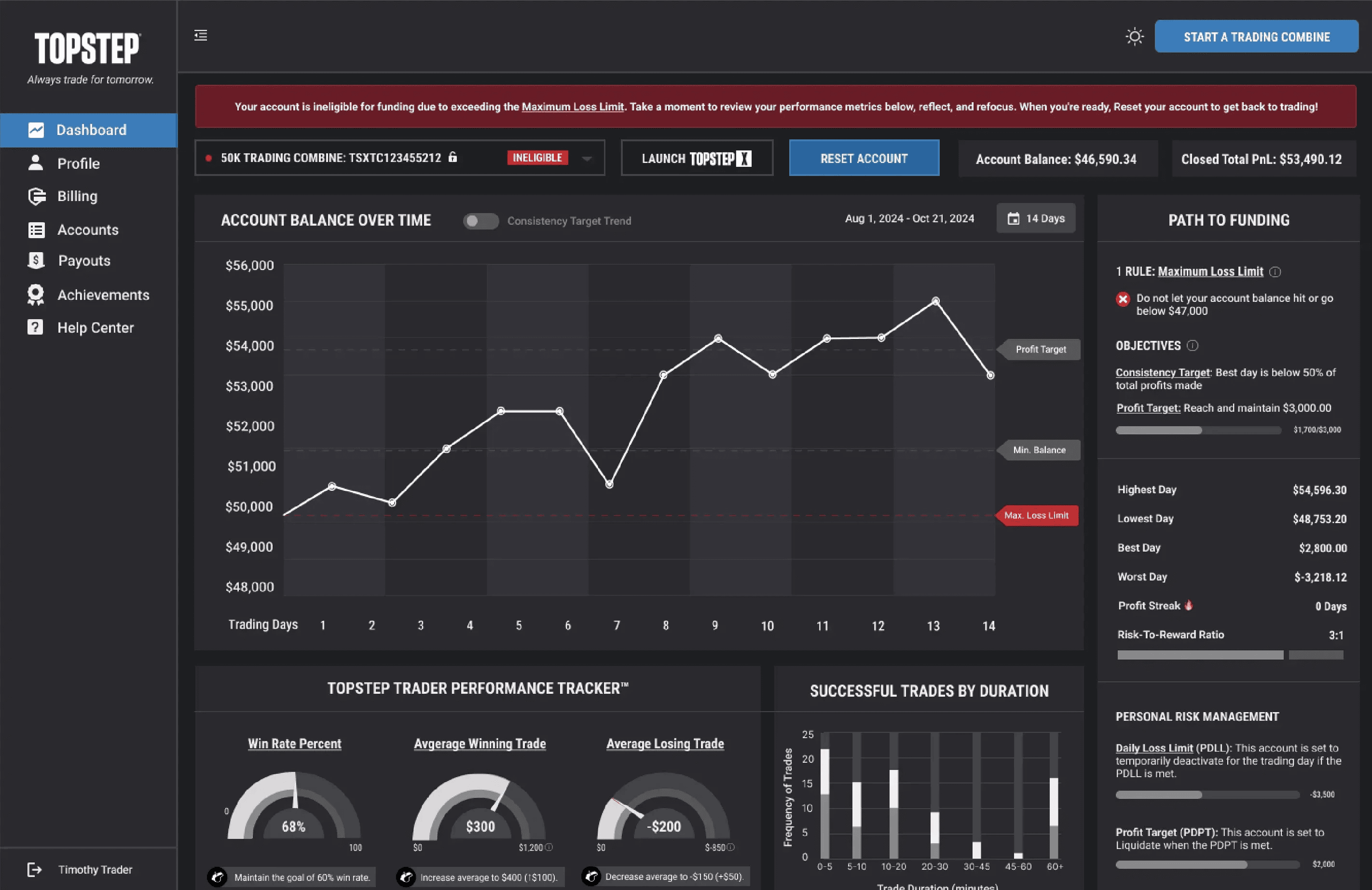
The project required close collaboration with engineering, product management, and executive stakeholders. I worked through data availability, design feasibility, product priorities, and leadership feedback to refine the page and move it through approval with the CEO and C-suite.
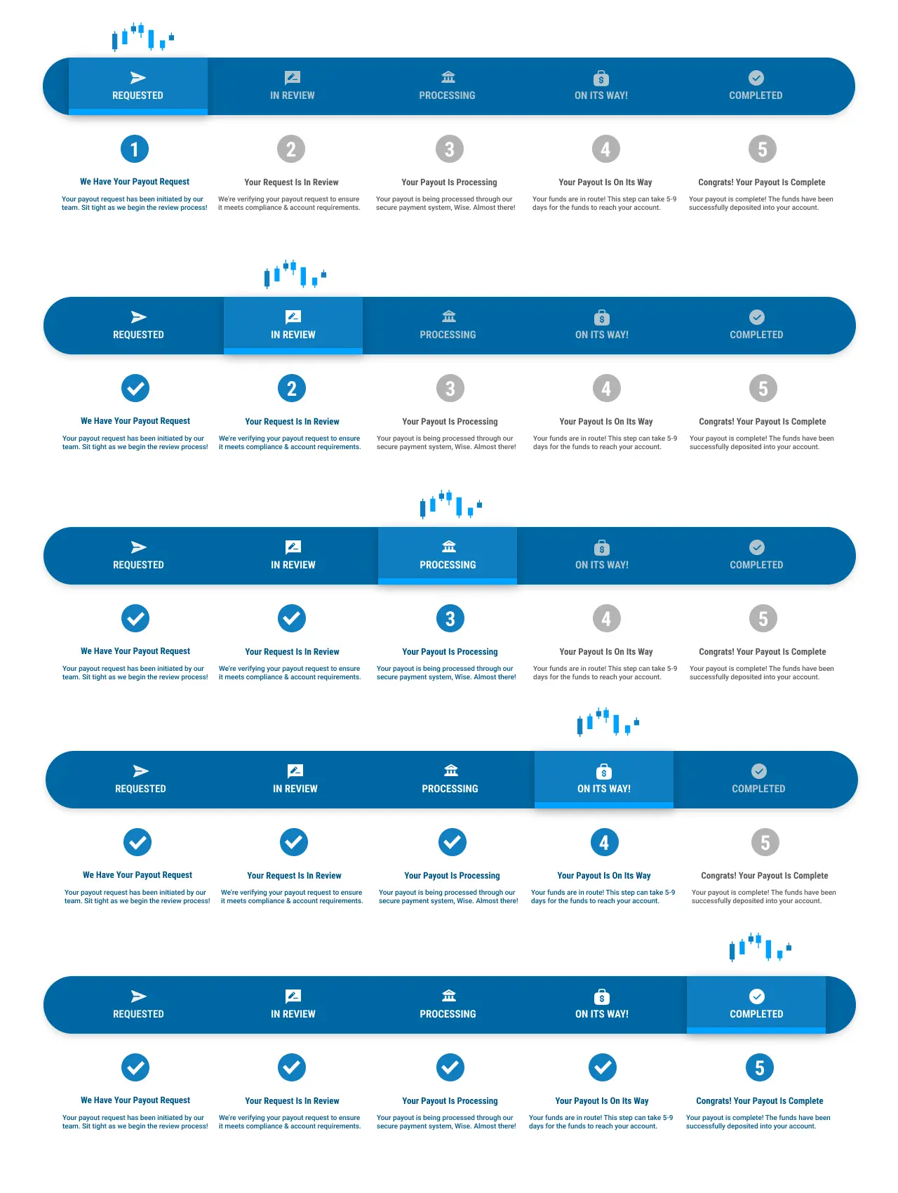
This work also extended beyond the dashboard. During this interim period, I continued supporting improvements across other areas of the app, helping organize information, refine layouts, and improve usability wherever the experience needed additional product design attention. The goal was to keep the product moving forward and create clearer, more useful experiences for traders while the company worked toward hiring a full product design team.
The final dashboard gave traders a more meaningful way to understand their performance and progress, turning raw trading data into a clearer, more actionable product experience. It also helped establish a stronger foundation for future product design work by introducing better hierarchy, clearer data presentation, and more intentional dashboard patterns across the app.

